SETLIB V2
Reducing worksheet preparation time by 81% by centralizing 17 years of course content
ROLE
Product Design Intern
TEAM
3 Designers
5 Engineers
Project Manager
TIMELINE
June - September 2025
(3 Months)
TOOLS
Figma
React
Description
How might we organize 17 years of content into a system that matches how faculty think, while reducing prep time?
As a Product Design Intern, I worked with a team to reimagine how computer science TAs create course materials. The first phase focused on a defensive MVP to handle technical constraints. The second phase leveraged a new AI parser to unlock a faster, confidence-based workflow. I personally owned the facilitator-facing experience end-to-end, from the initial search taxonomy to the final UI.
Context
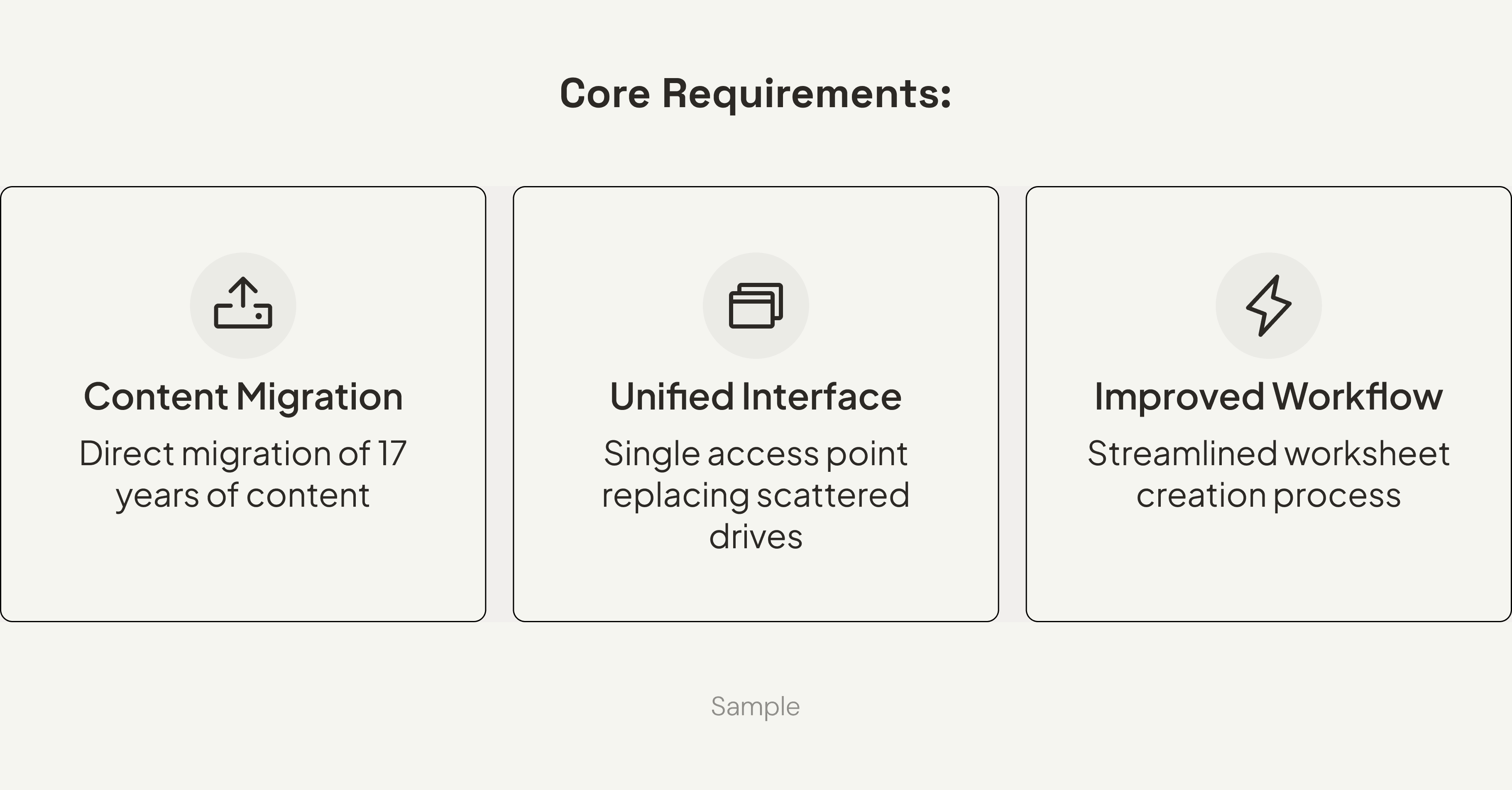
Faculty spent 4+ hours hunting through 100,000+ files organized by date—but they think in topics.
Facilitators are paid 10 hours per week. Six of those hours are outside the classroom, split between meetings and creating unique weekly worksheets. To build worksheets, they dig through 17 years of archived problems stored across scattered Google Drives—organized chronologically by quarter and week.
However, content was archived by date, while faculty think in concepts like "binary trees" or "recursion."
This meant facilitators were spending 3–5 hours per week just finding relevant problems. The system gave no meaningful feedback, wasn't searchable by topic, and offered no visibility into what had already been used.
Constraints
Parser limitations shaped every design decision and became the project's defining constraint.
Three technical and organizational constraints framed the entire project:
Parser capabilities were limited: It struggled with embedded images, mixed formats, and structural interpretation. It only handled LaTeX initially, with unpredictable failures.
Content variability was enormous: 17 years of files meant inconsistent formatting and quality. Real-world content far exceeded what our controlled test samples revealed.
No communication loop existed: Facilitators created worksheets, while professors oversaw quality. But they never communicated and there was no approval flow or feedback system.
These constraints shaped our principles, workflows, and validation approach.
Research
"Have you ever given up looking for something you needed?" Every single person said yes.
I interviewed 6 facilitators and 2 professors, focusing on where time was lost and what prevented them from finding the right problems.
Key insights:
Giving up isn't a productivity problem—it's an information architecture failure: Users weren't just slow. They were abandoning searches entirely and starting over because the cost of searching exceeded the cost of rewriting.
Role separation was essential, not optional: Facilitators needed speed. Professors needed oversight. Combining these into one interface created noise; they had different jobs-to-be-done.
Speed and reliability trump completeness: A solution that didn't surface the right content quickly became unusable. They preferred fewer, relevant results over exhaustive, disorganized options.
I built a functional React prototype to "break" our assumptions early.
At the time, the parser was still being developed in parallel with the design work. Engineering had shared that it struggled with images and complex formatting, but we needed more concrete data to design effective failure states.
Rather than wait for the full implementation, I built a functional prototype in React, then integrated it with the backend API. This let me stress-test the system with additional data and surface patterns before committing to design decisions.
[ui image of prototype here]
Basic LaTeX worked. Complex notation and diagrams didn't.
Testing showed the parser handled basic LaTeX well, but struggled with complex notation, math, and text-based diagrams. We learned which content types broke most often, how unpredictable the failures were, and what recovery options were even possible. Two nearly identical problems could parse completely differently.
At this stage, the parser was LaTeX-only and couldn't interpret embedded images at all, so we tested with text-based content that matched its capabilities.
This became the foundation for our V1 principles to design for failure, not success.
Strategy
V1 was built to handle failure, not hide it.
The parser failed unpredictably, and we couldn't change that. So instead of designing for perfect uploads and treating failures as edge cases, we designed for transparency first.
Topic-based search: Matched mental models (concepts, not dates).
Mandatory review for parser errors: Protected quality when the parser failed.
Role-based filtering: Gave professors oversight without slowing facilitators.
We accepted a critical trade-off. Mandatory review would slow workflows even when parsing succeeded. But we built side-by-side comparison views, explicit error surfacing, and manual correction tools. With frequent, unpredictable failures, trust mattered more than speed.
V1: Solution
We designed for trust, not speed.
Because the parser was unpredictable, V1 was built to expose failure points rather than hide them. By prioritizing transparency, we established a reliable system that allowed us to validate with real users while managing technical risk.
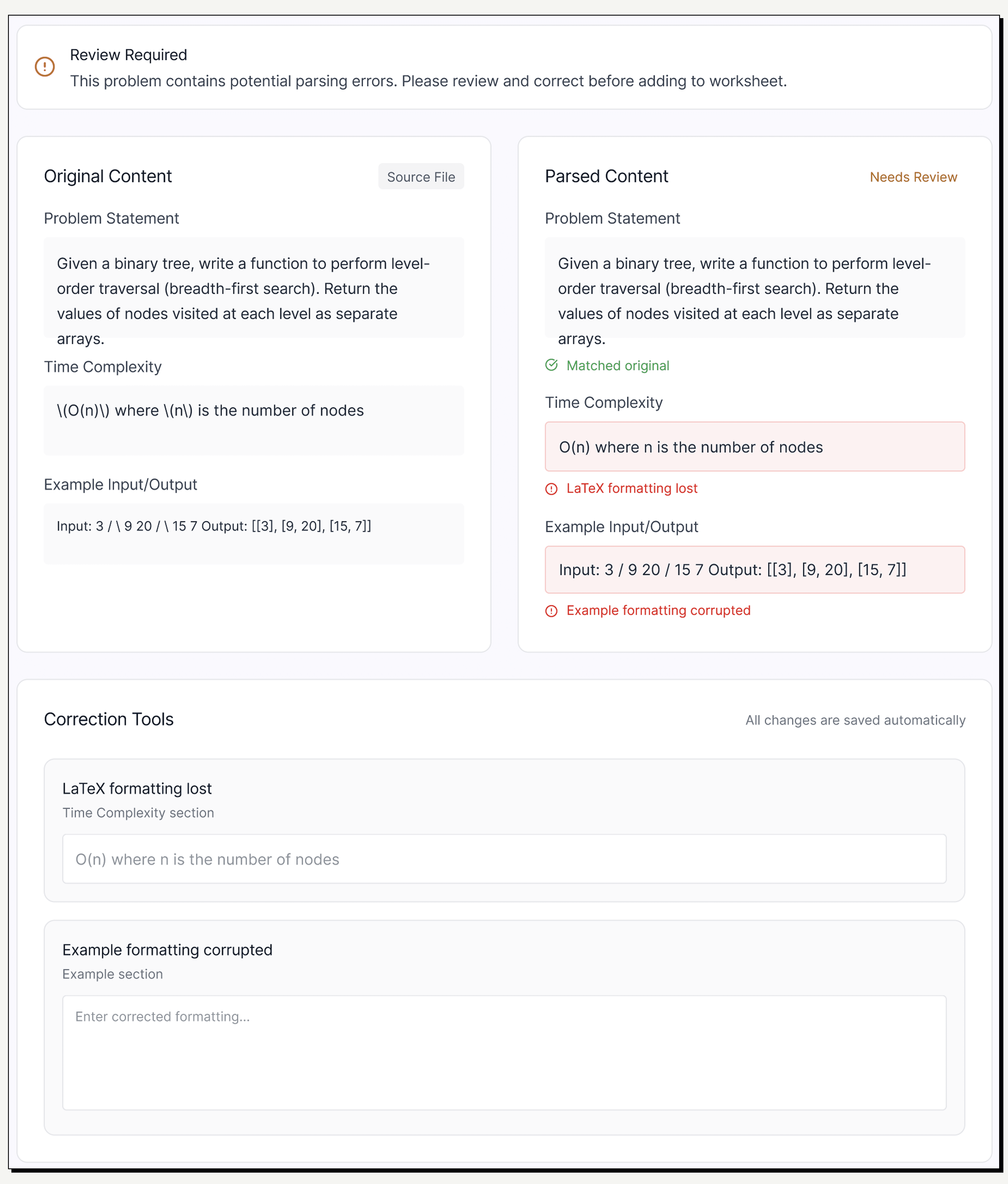
Side-by-Side Validation
To build trust in an unpredictable backend, I designed a mandatory split-view. Users can instantly verify the 'Raw File' against the 'Parsed Output' to spot hallucinations.
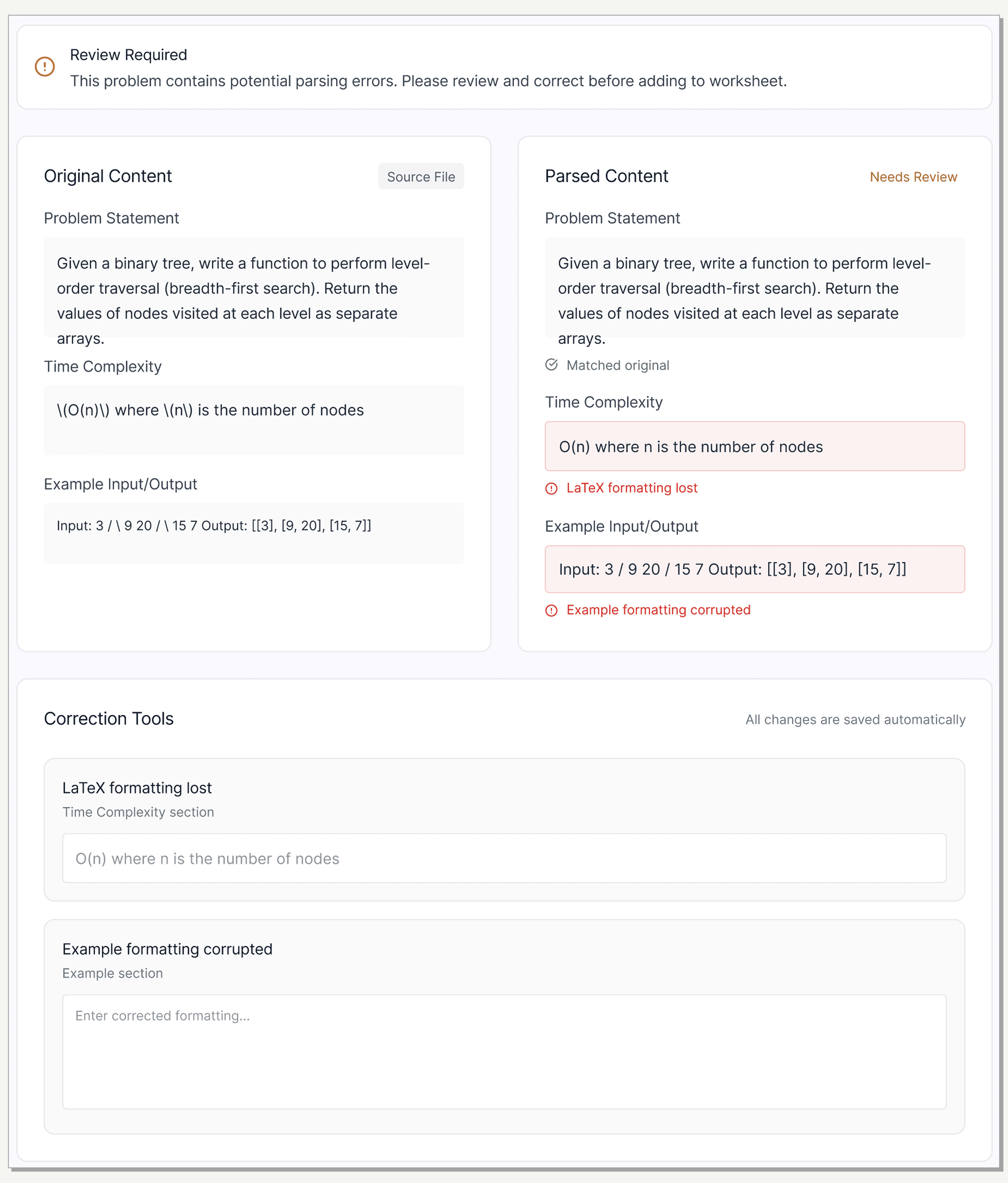
Side-by-Side Validation
To build trust in an unpredictable backend, I designed a mandatory split-view. Users can instantly verify the 'Raw File' against the 'Parsed Output' to spot hallucinations.
Search & Browse:
Organized by concept (Data Structures, Algorithms, Recursion).
Difficulty levels inspired by LeetCode (a familiar model for CS students).
[UI screen]
Assembly:
Mirrored real behavior: gather problems first, then organize.
Summary panel provided immediate feedback on difficulty balance to prevent surprises at review time.
[UI screen]
Review & Submit:
Intentionally simple to reduce distractions.
Reviewer notes closed the communication gap between facilitators and professors.
[UI screen]
V1: Impact
81% reduction in prep time—but production exposed a critical limitation.
We validated with 8 facilitators over 4 weeks using identical tasks.
Result: Time dropped from 4.2 hours to 0.8 hours.
Facilitator feedback: "Prep feels predictable now. I can make a worksheet in one sitting."
Professor feedback: "Seeing all pending submissions in one place removed so much back-and-forth."
But production told a different story: 90% of parser failures came from embedded images—the most common content type in CS problems. Our core assumption broke down for the exact content users relied on most.
Iteration
"Can I just insert problems manually?"—Users demanded a reliable fallback.
Production usage revealed the gap between our defensive UX and user needs:
90% image failure rate: Images and screenshots consistently broke the parser.
Manual insertion requests: Faculty repeatedly asked to bypass parsing entirely to regain control and correctness.
Unnecessary friction: When parsing did succeed, mandatory review became a bottleneck that users started to ignore.
We realized UX alone couldn't fix this. We needed a new parser capable of interpreting images and mixed formats.
V2
A hybrid LLM parser unlocked designing for confidence, not caution.
Engineering shipped a hybrid LLM parser that combined rule-based parsing with AI-driven interpretation. This fundamentally changed what was possible:
New Capabilities:
Handled PDFs, Word files, and mixed formats.
Interpreted images and provided context.
Surfaced specific failure reasons rather than generic warnings.
We moved from "Defensive UX" to designing for success.
Quantify confidence: Show accuracy scores upfront.
Trust by default: Shift from mandatory review to optional editing.
Transparent failures: Surface specific errors with actionable fixes.
V2: Solution
Confidence scores replaced mandatory review allowing speed without sacrificing trust.
Key workflow changes:
Confidence scoring upfront: Users see accuracy immediately. High confidence allows for "Save and move on."
[UI screen]
Optional editing: When the parser succeeds, users aren't forced into correction mode.
[UI screen]
Transparent failure handling: V2 shows specific issues (e.g., "LaTeX equation didn't parse") and offers guided next steps.
[UI screen]
Manual insertion flow: A full fallback for cases where parsing isn't the right option, giving users complete control over content and metadata.
[UI screen]
The trade-off: Optional editing relies on user judgment, but transparency through confidence scoring mitigates this risk.
Outcome
Reflection
Designing for failure first taught me to treat constraints as design inputs, not blockers.
What I learned:
Technical constraints shape what's possible: Getting close to engineering made limitations clear early and led to better decisions.
Production data > prototypes: Shipping isn't the finish line. Real-world usage revealed patterns we couldn't simulate in the lab.
Trust requires transparency: When the backend isn't reliable, visibility becomes a UX problem.
What I'd do differently:
Validate real-world content earlier: Earlier exposure to "messy" real documents would have surfaced image failures sooner.
Shorten learning cycles: Tighter feedback loops between design and engineering would have reduced rework downstream.
What's next:
Scaling to Seattle and Bothell campuses.
Exploring a "collections workspace" to help facilitators manage multiple worksheets simultaneously.